
TERSONS ESTATE AGENTS / brand refresh
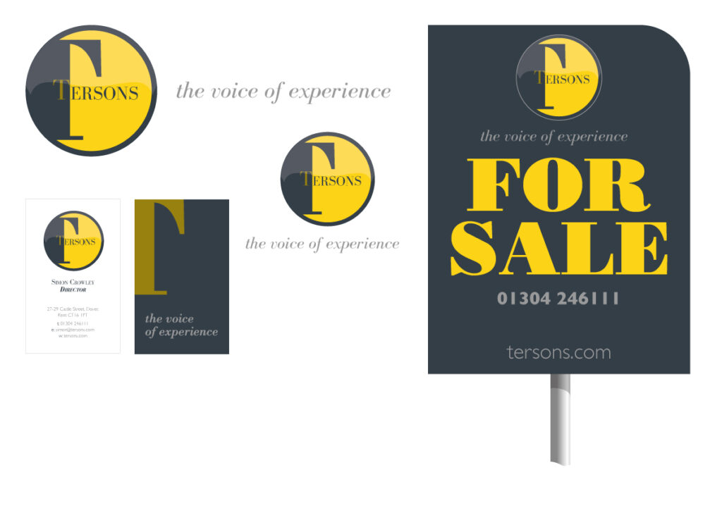
Terson Estate Agents, a well-established name in Dover’s property market, sought to rejuvenate their branding to stay competitive and relevant. Initially focused on refreshing their existing logo, colors, and fonts, the project evolved into a complete rebrand after in-depth consultations revealed a desire to better align their visual identity with their long-term vision and market aspirations.
The rebrand featured a sleek, modern logo paired with a sophisticated and refined color palette that exudes professionalism and executive appeal. These design choices were carefully balanced to retain strong accessibility and relevance to customers in the traditional residential property market. The updated branding communicates trust, quality, and expertise, ensuring it resonates with both upscale clients and everyday homeowners.
This comprehensive rebranding approach successfully positioned Terson Estate Agents as a forward-thinking yet approachable brand, reinforcing their market presence and enhancing their connection with a broader audience. This project highlights my expertise in creating branding solutions that blend strategic vision with market appeal, delivering impactful results that drive business growth.
Categories: Branding, Design for print. B2C/B2B Private and commercial Property.